CSS Tricks |
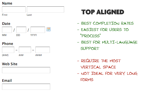
Posted: 04 Aug 2008 07:45 AM CDT When creating a web form, one of the many choices you must make is how you are going to align your labels with your inputs. This is not a trivial decision, as this placement affects the readability/usability of your form, completion rates, speed of completion, and ultimately the satisfaction level of the users trying to get through your form. But is there one ultimate answer for how you should be aligning labels? Not really, it depends on the specific needs of your form and the design constraints of the page. Lets take a look at the different choices and see the advantages to each. Top-aligned LabelsMost information suggests that top-aligned labels will result in the quickest completion times, the least user confusion, and the least amount of extraneous eye movement. Another advantage to top-aligned labels is the amount of horizontal room it affords the label. If your form will ever be translated or otherwise offered in another language, this extra room can be vital. Languages like French can be have labels up to twice as long as their English counterparts. Top-aligned labels sure do sound like a good way to go, and they are, except when vertical real estate comes into play. If your form is even moderately long, when you start adding up the label, input, and space between (which needs to be a little bigger to separate the fields from each other), you start getting pretty tall pretty quick. Quick completion times will diminish if your form requires extensive downward scrolling.
Left-aligned LabelsLeft-aligned labels have the advantage of being the easiest to quickly scan the label values. Since they are all in a nice vertical row and are not broken up by inputs, users can quickly scan each label and get a feel for the form. This can be ideal when the form is asking for unusual data, and the label for each needs to be clearly understood. Left-aligned labels bring the advantage of requiring much less vertical space, since each label and input pair is one one thin vertical row. However these savings in vertical space come at the cost of requiring more horizontal space. The design of your site may very well have the final say. The biggest disadvantage to left-aligned labels is that research shows they have the slowest completion times. This is likely because of the visual distance between the label and input field. The shorter the label, the further away it is from the input. I would suggest integrating current field highlighting (article/demo) if you choose left-aligned labels. Also keep in mind that slow completion rates aren’t always a bad thing, especially if the form requires unfamiliar data. If you are asking for things like Driver’s License Number or a Serial Number, you may implicitly want to slow users down a bit and make sure they enter things correctly.
Right-aligned LabelsRight-aligned labels share the same space advantages/disadvantages as left-aligned labels do: need more horizontal but less vertical space. Also, the language concern pops up again, there can be spacing problems if the form needs multi-language support. The big advantage to right-aligned labels is the strong visual connection between label and input. For shorter forms, right-aligned labels can have great completion times. Sometimes up to twice as fast as left-aligned labels, which have there inherit problem of less visual connection between label and input. Right-aligned labels disadvantage comes from scanability and comfortability. Your form will lack that hard left edge, which makes it less comfortable to look at and harder to read. This is minimized with short forms with familiar data though, so it may not be a concern. It certainly would be a concern though, with forms with longer question-style labels and unfamiliar data.
More tips:
More resources:
|


0 条评论:
发表评论